
A high-converting landing page is the difference between paying for clicks and paying for customers. Ads, emails and social posts create interest, but the landing page decides whether that interest becomes a lead or a sale. This step-by-step guide covers how we plan, write, build and test landing pages at Savoir Management, and the mistakes that quietly drain campaign budgets.
What is a landing page, and why does it matter?
A landing page is a standalone page built for one audience and one action, usually as the destination for a campaign. Because it removes distractions and matches the visitor's intent, it typically converts far better than sending traffic to a homepage.
Homepages try to serve everyone: new prospects, existing customers, job seekers and partners. A landing page serves one person with one need. That focus is why campaigns built on dedicated landing pages usually produce cheaper leads. It also matters for paid search: Google Ads includes landing page experience in Quality Score, along with expected click-through rate and ad relevance.
Step 1: How do you define the goal of your landing page?
Choose one measurable action, such as booking a call, requesting a quote, downloading a guide or buying a product, and design every element to support it. Pages with several competing goals convert worse.

Write the goal as a sentence before anything else: "Get qualified homeowners to request a free roof inspection." That sentence tells you who the page is for, what they want and what you are asking them to do. It also tells you what to measure.
Step 2: How do you match the message to the traffic source?
Repeat the promise from the ad, email or post in the landing page headline, and use the same offer, language and imagery. When visitors immediately see what they clicked for, they stay.
Message match is the fastest win in landing page optimization. If the ad says "Same-day AC repair in Austin," the headline should not say "Welcome to Smith Heating & Cooling." Create separate landing pages for different audiences, offers or keyword themes rather than sending every campaign to one generic page.
Step 3: How do you write a headline and offer that convert?
State the outcome the visitor wants in plain language, then support it with a subheadline that explains how you deliver it. Make the offer specific: what they get, how fast and what it costs, if anything.
Visitors decide quickly. Nielsen Norman Group found that users often leave pages within 10 to 20 seconds unless the value is clear. Strong headlines are concrete:
"Get a free roof inspection within 48 hours" instead of "Quality roofing solutions"
"Book a 20-minute website audit" instead of "Let's talk"
"Download the 2026 pricing guide" instead of "Learn more"
Below the headline, list three to five benefits written from the customer's perspective, not a list of features.
Step 4: How do you design for simplicity and flow?
Use a single column on mobile, one primary call to action repeated at natural points, plenty of white space, scannable sections and no main navigation. Every element should either build desire or remove doubt.
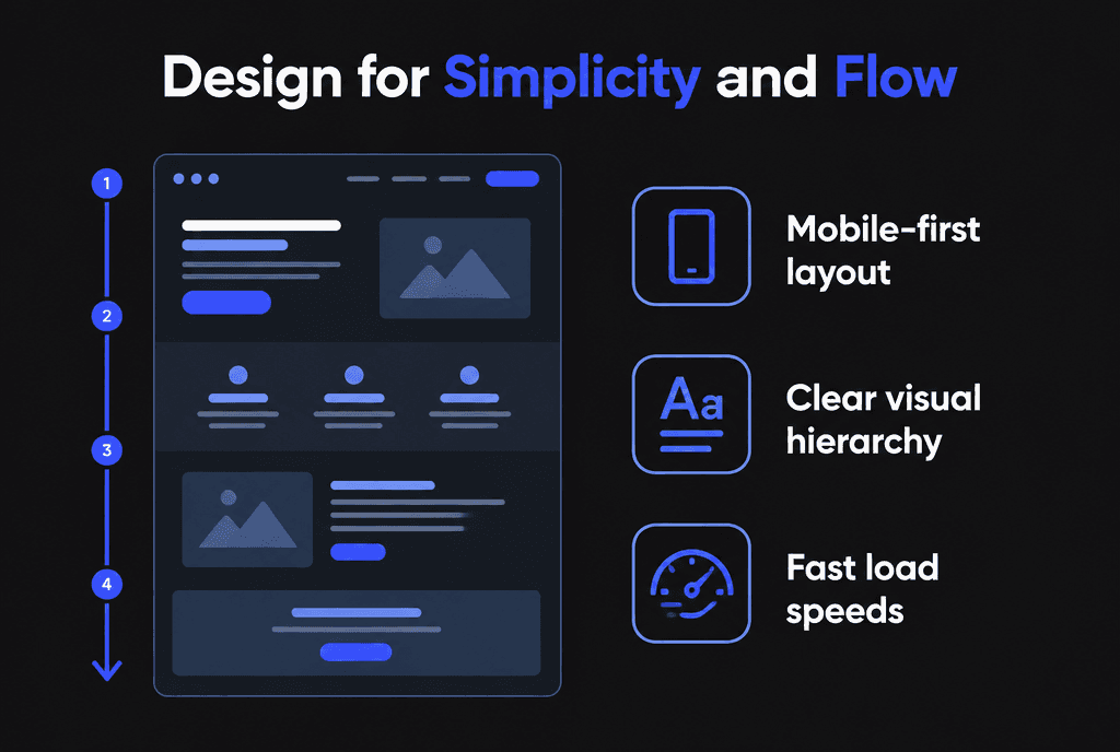
A reliable structure for most landing pages:
Headline, subheadline and primary call to action above the fold
Benefits that explain why the offer matters
Proof: reviews, logos, ratings, case studies or results
How it works, in three simple steps
Objection handling and FAQs
Final call to action
Readers scan rather than read word by word. Nielsen Norman Group's research on the F-shaped reading pattern shows why clear headings, short paragraphs and front-loaded sentences matter.
Step 5: Where should social proof go?
Place proof right next to the decision: reviews beside the form, client logos under the headline and a short case study near the final call to action. Proof is most persuasive at the moment of doubt.
Use specific, attributed testimonials that mention outcomes, star ratings with the number of reviews, recognizable client logos, certifications and guarantees. Avoid vague praise without a name. For regulated industries, check advertising rules about testimonials and results.
Step 6: How do you build forms that people complete?
Ask only for what you need to follow up, use visible labels, show helpful inline errors, explain what happens next and make the button describe the result, such as "Get my quote."
Nielsen Norman Group's form design recommendations include keeping forms short, using clear labels rather than placeholder text and validating input inline. Additional tips:
Use the right input types so phones show the correct keyboard
Mark optional fields rather than required ones when most are required
Put a short reassurance under the button, such as "We reply within one business day"
For high-intent offers, consider a two-step form that starts with an easy question
Step 7: How fast does a landing page need to be?
Very fast, especially on mobile. Paid visitors who wait for a slow page often leave, wasting the click. Aim for good Core Web Vitals and keep pages lightweight.
Target LCP within 2.5 seconds, INP of 200 milliseconds or less and CLS of 0.1 or less, as described on web.dev, and check pages in PageSpeed Insights. Compress hero images, avoid autoplay video, limit tracking scripts to what you need and reserve space for images to prevent layout shifts. Our site speed guide explains each fix.
Step 8: How do you make landing pages accessible and mobile-friendly?
Use readable text, sufficient color contrast, large tap targets, labeled form fields and keyboard support. Accessible landing pages convert more people and reduce legal risk.
Build to WCAG standards and test on real phones. Make phone numbers tappable, keep the call to action visible without hunting and check that pop-ups do not block content on small screens. See our mobile-responsive development guide.
Step 9: How do you track landing page performance?
Track the main conversion as an event, pass campaign data to your CRM and measure conversion rate and cost per lead by source. Track micro-conversions such as scroll depth and form starts to diagnose problems.
Set up conversions with Google Analytics recommended events such as generate_lead, and connect them to your ad platforms. Use UTM parameters on every campaign link so you can compare channels.
Step 10: How do you test and iterate for higher conversions?
Test one major change at a time, such as the headline, offer, proof placement or form length, split traffic between versions and wait for enough conversions before deciding. Then keep the winner and test the next idea.

Google Ads lets you split traffic between landing page versions with custom experiments. Good tests to start with:
Headline focused on outcome vs. headline focused on speed or price
Short form vs. two-step form
Testimonials beside the form vs. below the fold
Free consultation vs. downloadable guide as the offer
Small pages with little traffic may never reach statistical confidence. In that case, make bigger changes based on clear evidence, such as session recordings or form analytics, and compare results over longer periods.
What does a landing page cost, and what return should you expect?
A professionally built landing page typically costs a few hundred to a few thousand dollars, depending on copywriting, design, integrations and testing. Its return depends on traffic quality and offer, so judge it by cost per lead and revenue, not by the build price.
Run the numbers before you build. If a campaign sends 1,000 visitors a month and the page converts at 3%, you get 30 leads. Raising the conversion rate to 5% produces 50 leads from the same ad spend, which lowers cost per lead by about 40%. That improvement usually pays for the page many times over. Landing pages also make other channels better: email campaigns, social posts and partner promotions all perform better when they point to a focused page instead of a general homepage.
What landing page mistakes waste ad spend?
Sending ads to the homepage, mismatched headlines, multiple competing calls to action, long forms, slow pages, missing proof and no conversion tracking.
Full site navigation that invites visitors to wander away
Generic stock photos that say nothing about the offer
Calls to action like "Submit" or "Learn more"
Different offers in the ad and on the page
No thank-you page or confirmation, which also breaks tracking
How do landing pages fit into a bigger strategy?
Landing pages work best as part of a funnel: targeted ads or content bring the right visitors, the landing page converts them and follow-up emails or calls turn leads into customers.
Read our guides to web development for lead generation, conversion-focused web development and how to launch a profitable Google Ads campaign. Our Google Ads team builds campaigns around landing pages like these.
Why does Savoir Management excel in landing page development?
We start with the campaign goal and audience, write message-matched copy, build fast, accessible pages, set up tracking before launch and keep testing after the campaign starts.

Our web development team builds landing pages for service businesses, e-commerce brands, SaaS companies and agencies, and can launch new pages quickly with our fast-turnaround process.


